• iOS / Android / Windows apps + responsive web
  • Role: Design Director; team of 9
  • Agency: Rosetta

Overview

Digital Life is AT&Ts home automation, home security and in-home Care suite allowing cutomers to control all the opted-in features of a digitally-integrated home. From typical features like remotely arming & disarming the alarm, controlling lighting and thermostats and unlocking a door to more nuanced features like panning, tilting and setting up hot spots on cameras to creating detailed programs for triggered time-based, or motion-detected, events. The third component, Care, is a set of functionality and progress-reporting for those responsible for providing 24-hour care for another.

About the Design

Leading a team of 9 outstanding designers, Art Directors and an ACD, and colaborating with a superb squad of 6 UXers, we scrapped what was a 1.1-star-rated app, completely re-architected it then precision-crafted a comprehensive, elegant and cohesive design system for Android, iOS and Windows with a companion, responsive website.

4,000+ wireframes and over 1,250 visual design screens later, we launched Digital Life v2 which, within a month of release, elevated the experience from 1.1 stars to 4.5 and 4.7 stars in the Play and App Stores—a feat of fluid collaboration, diligence, dedication and meticulous care I’m quite proud of.
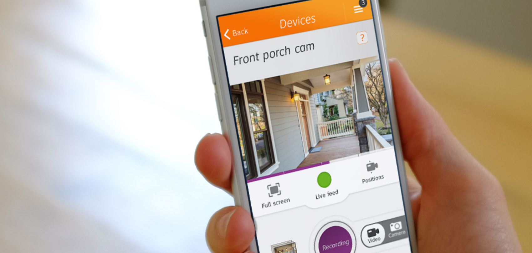
Automation & security

Receive notifications, review alerts and check in on your home in real time.


Home security live camera feed image

The connected companion

The utility to control things at home and care for and protect loved ones—when you aren’t there.

Dashboard

Digital Life home dashboard screen in a tablet

Digital Life: Care

One day, you may be responsible for the 24-hour care of a loved one. The Care component of Digital Life allows you to set Programs and Activities to monitor and report on progress when you’re not physically there. Care allows you the flexibility and assurance to continue with your day-to-day life while allowing the loved one you’re caring for to be where they’re most comfortable—in their own home.

Meet Fred

Fred, your father, is long-retired and beginning to have some difficulty being on his own. Typical options are moving him in with you, in with another sibling, you moving in with him, relocating him to an asisted living facility or hiring a full- or part-time home nurse. With Care, there is now a framework where Fred can stay home giving you the support you need to help support Fred.

DL Care: Activities

An example with Fred

Stitching together a series of micro events that allow you, the caregiver, to arrive at a logical conclusion is essentially the construct of an Activity. Let’s say Fred has to go on a morning walk. Here’s what the string could look like:

  • IF after 9am the living room detects motion AND the front door opens AND the front door closes
  • ...AND...
  • IF after 9:15am the front door opens AND the front door closes AND the living room detects motion you can conclude that Fred went on his walk.
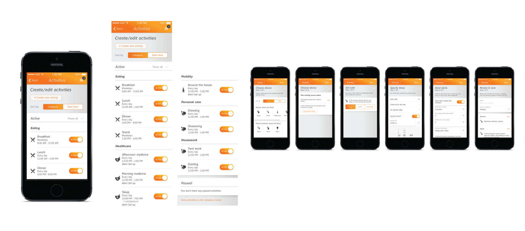
  • We designed the creation of an Activity via a simple and intuitive linear path:

  • Choose the device(s) to be triggered
  • Set the rules
  • Specify the time(s)
  • Choose where, how and when to be alerted
  • Review and save...then fine-tune if the Activity needs to change
  • Multi-screen process for creating an activity

    DL Care: dashboard

    We designed the Activities Dashboard to be both informative and versatile while also being clear and scannable. It is easy to see the current view (in this case Day view), the date, the current time, what activities are pending and what activities were performed or missed.

    Here we can also see that Fred did, in fact, go on a morning walk at around 9:20am...and again at 11:30am. Go Fred!

    Fred's activities: Today

    Digital Life home dashboard screen in a tablet

    DL Care: Activities

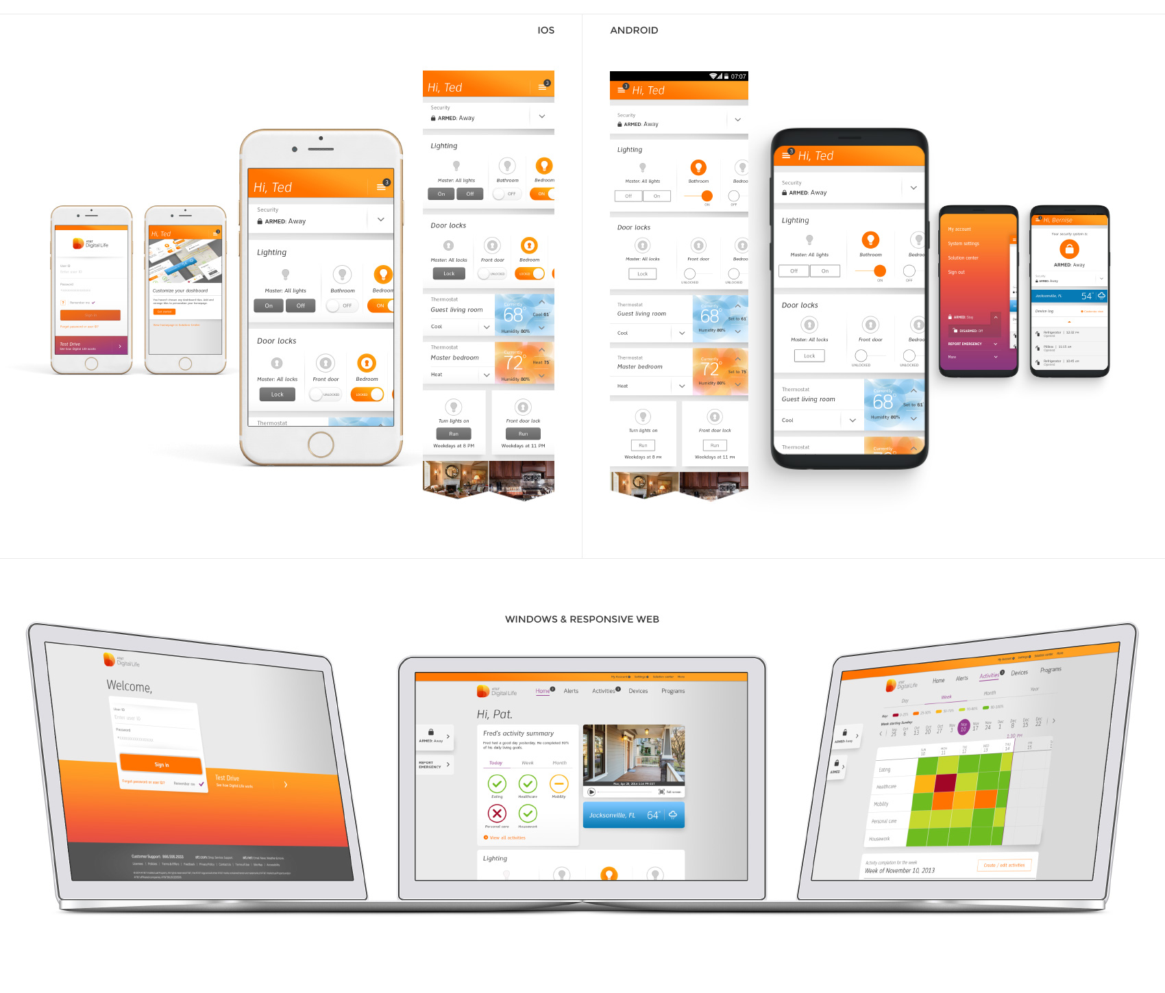
    We crafted the design system to be flexible within the nuances and interactions of each platform while remaining incredibly cohesive as a whole.

    iOS, Android, Windows (PWA) and responsive web.

    Multi-screen process for creating an activity

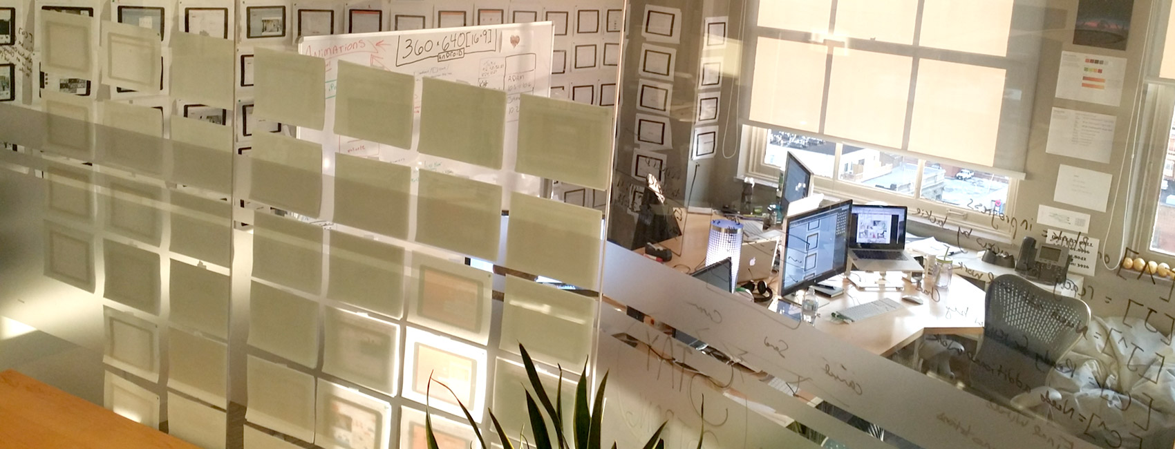
    Behind the scenes

    The sandbox of visual and ux design


    Home security live camera feed image


    One of many interaction prototypes


    A few Behind the scenes notes

  • As the Design Director, I led the team 9 visual designers
  • Collaborated with an esteemed squad of 6 UX-ers
  • The team was spread throughout 5 offices
  • Created over 1,250 visual design screens
  • Over 4,000 wireframes
  • A Funcitonal Design document so heavy it almost crippled the Acrobat
  • Digital Life v1 was a 1.1 star-rated app. Within a month of our v2 launch, the app jumped to 4.5 and 4.7 stars in the Apple and Google stores.


  • “In my 10 years of conducting user testing, I have never tested a better app.”

    Jill, the moderator


    White AT&T Digital Life logo